Chrome Yellow | Connections: How colour interacts with the wider world
Source | Connections | Physis | Sense
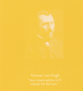
Vincent van Gogh © Atelier Éditions
“Here comes the sun, little darling,” wrote George Harrison in 1969 while staying in Eric Clapton’s country house. He was playing truant from an Apple Corp meeting with the Beatles, and relieved from the pressures of work, he created his best-loved song, one that celebrates the changing of the season. It conjures images of dappled light falling on fresh grass, baby lambs and clusters of daffodils… Spring. Eggs crack, chicks hatch, and little bare feet run through the buttercups and daisies. Yellow yolk in the snow white of winter. Our beloved star, Sol, pulls in the Northern hemisphere as it travels the ribbon of earth’s annual ellipse, and colour blooms again. Nature signals this moment of transition with pops of pure chrome yellow, a tone that sparks rebirth, awakens the mind and keys us into the joy of new beginnings. The brightest colour the human eye can see, yellow is a primary colour, used historically by artists to enliven green pastures and illuminate horizons.
Look at the stars
Look how they shine for you
And everything that you do
And they were all yellow
– Coldplay, Yellow, 2000.
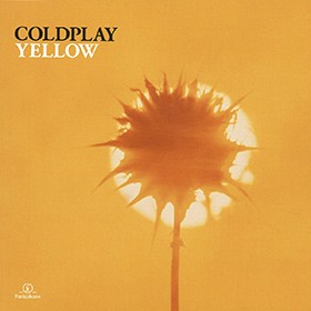
Cover art for the single Yellow © Coldplay
After a long day recording their debut album Parachutes at the famous Rockfield Studios in Wales, the four band members of Coldplay stepped outside under the blanket of night, and their producer Ken Nelson told them to look at the stars. There was a crisp clarity to the air, the kind you only get far from city light pollution. Martin was so inspired by the sight that a melody popped into his head. “Look at the stars, look how they shine for you, and everything that you do,” it began. The song was half a joke to start, “something Neil Young would sing”. It grew on Chris and the band, but they needed a hook, a word that would sum up the mood of the song. The next day, as he was trying to finish the lyrics, their friend Stephanie walked past, in what Martin perceived as a yellow glow. The vibrant shade perfectly captured the mood of the band whilst creating their first album, and its centrepiece Yellow would launch them to international stardom.
However, when the band were scheduled to make the video for Yellow in Studland Bay, Dorset, the mood was very different. Drummer Will Champion had buried his mother that day, and it was raining heavily, reflecting their sombre mood. Directors James Frost and Alex Smith changed tack from their sun-drenched video plans, deciding on a single take of Chris Martin walking along the beach, rivulets pouring down his face, singing the lyrics to camera. As he proceeds along the beach, the leaden sky gradually lightens, promising to become a beautiful day. It reminds us – in Henry Longfellow’s evocative phrase – that, “Into each life some rain must fall”, but “Behind the clouds is the sun still shining”. This promise of sun after the rain was the perfect counterpoint to the optimistic feel of the hook and melancholic, otherworldly melody.
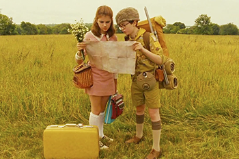
Moonrise Kingdom, 2012 © Wes Anderson
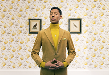
Colours are charged with the emotions we associate them with: they can both temper how we feel or heighten our response, a fact that has been used throughout history to evoke a reaction. Director and screenwriter Wes Anderson is known for his ironic or naive use of colour, often at odds with the drama. He finds particular solace in chrome yellow. Most directors use colours to establish a mood that is in keeping with the action or emotions, but Anderson creates his distinctly offbeat tempo through a levity that counterbalances grim situations, such as the yellow submarine in The Life Aquatic with Steve Zissou (2004). Like British director Peter Greenaway, who also played with the jarring effect of colour, every film still is a perfect composition, with Anderson and production designer Adam Stockhausen paying meticulous detail to the balance and contrast of colours in each take. Owen Wilson, a close friend and recurring player in Wes Anderson’s cinema, said, “It’s a world that Wes Anderson creates… slightly artificial, but… within that world, the emotions and feelings are very real”.
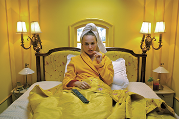
Hotel Chevalier, 2007 © Wes Anderson
This effect, termed ‘whiplash juxtaposition’, has led many to read his films through the auteur theory, a prism of intense self-reflection where unresolved emotions are played out. Yellow is used to emphasise happy moments, such as the sky in Fantastic Mr. Fox when the foxes are at their happiest, the yellow glow of the girl in Isle of Dogs, or Steve Zissou’s yellow submarine, used to counter the tragic loss of his son by taking his whole crew to finally see the yellow-spotted leopard shark he had been searching for.
Emile, 2018. Portraiture Winner, 2018 Sony World Photography Awards © Nick Dolding
Use of the colour yellow to counter the darkness of a situation or mood has long been a staple of children’s television and cartoon characters: not only to stand out but to convey optimism. The Simpsons’ creators made their all-American family yellow to temper their running commentary on the nastier side of US culture; Tweety Bird is so cute you hardly notice how cheeky she is; and Sponge Bob Square Pants would be groteseque and depressing if he weren’t a cheery shade, not to mention The Minions. Perhaps most ubiquitous of all is the face of our universal language of emotional response: the emoji. In our tech-driven global patois, the yellow smiley face is a key component of day-to-day communication – instantly visible and race neutral. On the one hand they are a light-hearted shorthand; on the other they are becoming the only form of validation for many young people. The issue is their lack of variety and limited nature in turn limits a granular and complex emotional response. Like a bright summer’s day or a flash of lightning, they burn through any nuance.
So, yellow catches our attention. It is quite literally head-turning: due to the way the colour cones in our eyes process light, prioritising yellow first (1.24 times more than red), it catches our immediate attention, even in the dark. This links us to the use of yellow in the urban environment – from taxis to school buses and yellow lines. Standing out against the greyscale of the city roads, it was adopted by cabs in London, Paris and Chicago more than 100 years ago, and when adopted by taxis in New York reduced accidents by a staggering 9%.
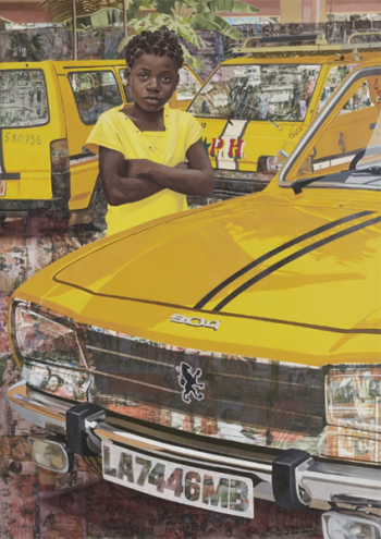
The Beautyful Ones, Series #7, 2018, Njideka Akunyili Crosby: courtesy of Victoria Miro © Njideka Akunyili
Van Gogh painted the stars as yellow, tiny suns billions of miles away, warming the dark night, their meaning uniquely personal to each frail human soul, giving guiding light and reassurance to those missing the daylight and our own small sun. Maria Popova starts her new book Figuring with the lure of the stars, telling of a young astronomer, Maria Mitchell, looking up in 1831. “Mingle starlight with your lives,” she would later tell the first class of women astronomers at Vassar, “And you won’t be fretted by trifles.” Popova goes on to ask: “Where does it live, that place of permission that lets a person chart a new terrain of possibility?”
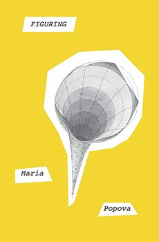
Figuring, 2019, Maria Popova © Pantheon
‘…won’t you celebrate with me
what i have shaped into
a kind of life? i had no model…
i made it up
here on this bridge between
starshine and clay’
Lucille Clifton, as quoted by Popova in Figuring.
Source | Connections | Physis | Sense