Emerald Green | Source: How colour takes us on a journey
Source | Connections | Physis | Sense
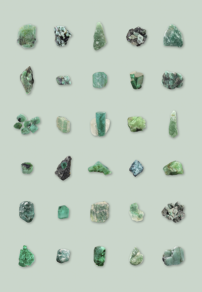
Emerald, 2019 © Andrea Hamilton
“Calmness of mind is one of the beautiful jewels of wisdom. It is the result of long and patient effort in self-control. Its presence is an indication of ripened experience, and of a more than ordinary knowledge of the laws and operations of thought.”
– James Allen, As A Man Thinketh, 1903
In the last busy days before Christmas, every day feels like a party – a time for sequinned dresses and extravagant jewels, champagne, high heels and human connections with friends, family, work colleagues. It is a fabulous glittering whirl, culminating in New Year’s Eve, where we celebrate the old year and face the new; a strange combination of hedonism and inner sight as we map our future and make resolutions to be our best selves. And this year we face a not just a new year but a new decade too: the 2020s. The end of the year is a powerful thing: the dead of winter holding within it the promise of rebirth. No wonder the ancients brought in green wherever they could – holly, ivy, fir trees. A touch of emerald to remind us of the coming spring, of abundant nature and the generosity of our beautiful planet.
While the party season may be a relatively new facet of civilisation, putting on a public face with make up was as important 4,000 years ago as it is now. The beauty regime of a wealthy woman in the Middle Kingdom of Ancient Egypt was a ritualistic indulgence, performed by a small army of servants. After she luxuriated in milk baths, they would exfoliate her skin with Dead Sea salts, apply milk-and-honey face masks, and then anoint her with floral or spice-infused oils. Next, a servant would lay out the lavish ingredients and tools necessary to create and apply her makeup. Exquisite art objects, crafted with precious materials like calcite and gold, they contained treasures, for the expert maquillagist would create eyeshadow by mixing powdered malachite with animal fat or vegetable oils – for for a queen, like Cleopatra, she would crush actual precious stones. In addition to black kohl, she wore golden-flecked bright blue eyeshadow on her top eyelids and vivid green on her lower eyelids, made from emeralds. Not only would it be a fabulous party look even today, the siltstone palettes used to crush materials for kohl and eyeshadow were carved with symbols represented rebirth and regeneration; the act of grinding pigments on a such a palette thought to grant the wearer special capabilities.

This modern reproduction of the Emerald tablet was designed as it has been described for over 3000 years by Hermetics and in Gnostic texts © Adept Initiates
“Whatever anyone does or says, I must be emerald and keep my colour.”
― Marcus Aurelius, Meditations
A gem of talismanic status in Ancient Egypt, 20 times rarer than a diamond, the emerald’s rich colour was a rare vision in the golden desert. This lush ‘Jewel of Kings’ was thought to be healing for the eyes, an association that has remained. The Emerald Tablet – an ancient esoteric text – was said to hold the secret of the philosopher’s stone, which could transmute base metals into gold. And emeralds reflect the calming green light waves that represent the colour of Eden: the colour of paradise, and its bounty, and from there wealth and prosperity.
For artists however, a true emerald pigment was frustratingly hard to find; mixing greens from blue and yellow produced colours as unstable as new leaves on trees, and like them would brown with age. As Michel Pastoureau points out in Green, it is the most chemically and symbolically unstable of the basic colours. “Green can signal both fortunate and sinister aspects of the thing.”
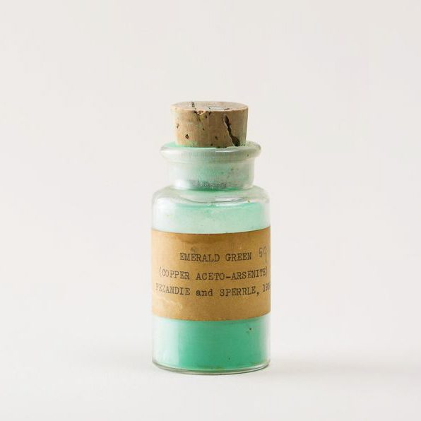
Emerald Green, Copper Aceto-Arsenite © Pascale Georgiev for Atelier Éditions
The first available synthetic version was Scheele’s Green. Made from copper arsenite, it quickly replaced verdigris after its discovery in 1755, but it had the great disadvantage of producing nausea, vomiting, rashes and – when used for wallpaper – contributed to several deaths. Another emerald green pigment, also known as Paris green, Imperial green or Veronese green, was developed in 1808 and marketed as a more brilliant and durable alternative, but still contained poisonous arsenic.
Painters, however, were willing to take the risk. In order to fully understand why, one needs to look backwards to the Renaissance and one uniquely green-fingered colourist: Paolo Veronese. Heir to Titian’s revolutionary technique of using colour as a constructive medium, his ability to produce internal harmony in a painting whilst reconciling the most strident hues was breathtaking, and there is one colour we have to thank for this: green.
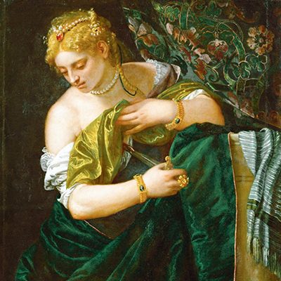
Lucretia by Paolo Veronese from c. 1585 © Public Domain
A colour between the bright warmth of yellow and the crystal cool of blue, it is a tone we find abundantly in nature and yet rarely on the canvas before the 19th century. Veronese’s greens were malachite, green earth, verdigris and copper resinate. He used greens to give his paintings a continuity of colour never before seen. Known as tonal paintings, Veronese worked from a predetermined colour palette, which would unite the whole composition (much as interior designers work today). In Adoration of the Kings (1573) a bright green is mixed from three pigments applied in two layers, a technique that was so successful that when the first truly bright green synthetic pigment was created in the 18th century, it was known in France as vert Paul Veronese.
Of course, the reason why this shade – the colour of a chlorophyll-rich leaf with the sun shining through it – became so desirable was because it was the colour of mother nature herself. Emerald came to represent the holy grail of landscape work. Artists like Nicolas Poussin conceived of complicated mixtures to achieve their variegated greens, often underpinned with lead white. The critic Christopher Wood points out, “They were not depictions but interpretations of nature.” In this sense, according to Roger de Piles, painters re-created landscapes to suit their own vision in an: “Imagined reality. Their eyes see the objects of nature coloured as they are used to painting them.” Emerald green is a colour that reminds us what we see in the world has everything to do with how we represent it.
No one used the new synthetic emerald green pigment quite like the Pre-Raphaelites. In her essay on the use of green, Stephanie Graham Pina says, “Dante Gabriel Rossetti is the artist that usually springs to mind when I think of green. His works teem with it.” It was the shade that best complimented his muses Jane Morris and Alexa Wiling, a perfect contrast with their lustrous auburn and strawberry-blonde hair; the hue of his obsession. One of Rossetti’s last paintings casts Jane Morris in a world bathed in green, tinged with longing. Surrounded by foliage, seemingly lost in a day dream, her open hands holds a wilting flower, one of the rare instances of his use of pink – to match her cheeks – in an otherwise emerald world.
Inspired by late Medieval and early Renaissance works, Pre-Raphaelite paintings were wildly different in tone and subject to their contemporaries. Whilst Turner was creating great sea mists from memory, the ‘Brotherhood’ vowed to stay true to nature, which resulted in near photorealism of botanical details. Of course Rossetti was familiar with Veronese, writing in a letter to F.R. Leland, “In colour, I shall make the picture a study of varied greens.” These works are profoundly nostalgic, full of longing for a lost Arcadia. In a rare interior scene, Veronica Veronese, painted in 1872, Alexa Wilding appears in a green gown borrowed from Jane Morris, worn in Proserpine, Astarte Syriaca, and The Day-Dream.
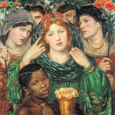
The Beloved (The Bride), 1865–6, Dante Gabriel Rossetti © Tate
Little wonder that in 1929 when Tamara de Lempicka was commissioned to paint a self-portrait for the cover of German fashion magazine Die Dame, she chose emerald green as its dominant tone – but wonderfully, not for something as obvious as her dress. Autoportrait is an image of the artist at the wheel of a racing green Bugatti, sporting a leather helmet and gloves, cocooned in a cool grey scarf. Known to be Madonna’s favourite artist, this self-portrait celebrates the fresh independence and liberation of women post-World War I. Considered one of the best examples of Art Deco, Lempicka easily controls her vast car, looking defiantly out at us, red lips pursed, on the road to achieving her own desires.

Autoportrait (Tamara in the Green Bugatti), 1925, Tamara de Lempicka © Private Collection
In colour psychology, green is thought to help balance emotions and promote a sense of calm and clarity. It’s an inspiring and uplifting colour, suggesting abundance and wealth in all its forms, from the material independence to emotional wellbeing to creativity. The colour of nature, being in green helps to creates space in the mind – like a clearing – and encourages growth both mental and spiritual. It is a hue that gives you permission to move forwards. But it is also the shade of jealousy, of the spurned lover, of bitter arsenic poisoning and destroying ever-green love. Emeralds are also believed to hold healing powers, both emotional and physical. It is believed that an emerald can lift depression, cure insomnia, detoxify blood and cure ailments of the heart, eyes, pancreas, backbone, lymph nodes, intestines, kidneys and thymus. Many believe that wearing an emerald will provide willpower, mental clarity and the easing of stressed states.
What a powerful statement for one (not so) simple colour. Happy New Year, dear friends: may 2020 bring you fresh shoots of happiness, creativity, wellbeing and inner peace. A gift from the gods themselves.
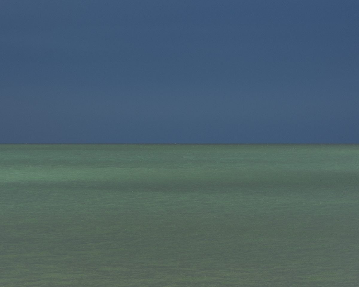
Sea of Emerald Green, 2014 © Andrea Hamilton
Source | Connections | Physis | Sense