Mauve | Sense: How colour engages us
Source | Connections | Physis | Sense
“Patrick mixed paints – a delicate shadowy mauve, a scarlet… a square head appeared, and a decorative trellis of flowers. Various faces, shadowed in the delicate mauve, existed for a moment, and then were wiped away… I became entranced by the shadowy half-depths of that particular mauve running across the canvas.” A.S Byatt on being painted by Patrick Heron, Modern Painters, 1998.
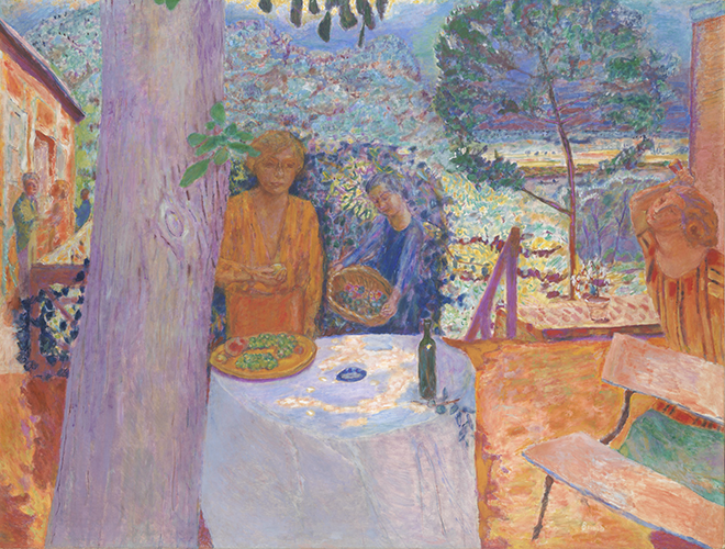
The Terrace at Vernonnet, 1939, Pierre Bonnard
© Artists Rights Society, New York
In late spring of 1883, Monet moved his new family to Giverny, a small village 50 miles west of Paris. There he set about creating the flowering garden that would become the subject of his masterpieces. He sowed his favourite annuals around the house – nasturtiums and irises – planted primroses, wisteria and swapped seeds and cuttings with fellow Impressionist painter Gustave Caillebotte. Seven years before, he and other young, radical artists had mounted an independent exhibition in protest at the stuffy, establishment Salon de Paris, and dumbfounded critics with his Impression, Soleil Levant. It was a painting bursting with new pigments synthesised from organic compounds: mauve, cobalt violet and chrome yellow. Finally artists had access to materials that could show what they really saw – and felt.
This was the painting that defined a movement: Impressionism. Monet’s ambition was to capture the momentary, transient effects of sunlight by painting en plein air. He would paint the same scene numerous times to accentuate the effects of the passage of time. His atmospheric works were mocked for both technique (“Wallpaper in its embryonic state is more finished than that seascape,” said critic Louis Leroy) and purplish palette (dramatist August Strindberg wondered if they were all mad). His love of violet and mauve was not only for their vibrancy, but also because they were the peripheral colours on the visible spectrum – perfect for portraying the atmosphere between things.
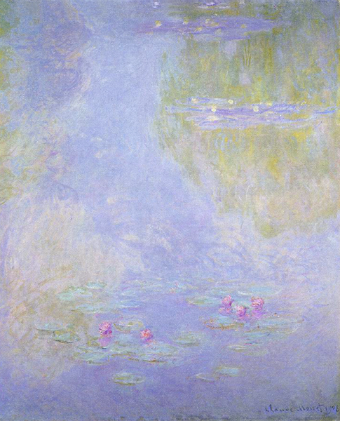
Waterlilies 1908, Claude Monet
© The Davies Sisters Collection
The Impressionists showed us the variegated hues of purple in the shadows; haystacks, bridges and trees awash with pinks and violets, the colours he had grown up with in la douce France. However, the great irony of this new, natural way of painting was that these pigments did not come from petals or the earth but were extracted from the gloom of coal tar. The colours represented man’s ability to manipulate nature – a concept familiar to the constant gardener – but whose far-reaching consequences were not yet understood. David Scott Kastan and Stephen Farthing put it beautifully in On Color:
“Nature itself suddenly began to appear ‘absolutely modern,’ according to Oscar Wilde [in his essay The Decay of Lying], ‘looking like exquisite Monets and entrancing Pissarros,’ with landscapes and skies made up of ‘strange blotches of mauve’ and ‘restless violet shadows’… the Impressionists allowed—no, trained—our eyes to see nature differently: to see it dressed in colour tones and modulations of light that, as Wilde pronounced, ‘did not exist till Art had invented them’.”
Monet’s nuanced sensibility towards colour would influence all future generations of painters, including one of the greatest colourists of the early 20th century, the Post-Impressionist Pierre Bonnard… In 1910 Bonnard left Paris to take up an unfashionably quiet life with his wife Marthe in the countryside near Giverny. There, like Monet, he painted his vivid masterpieces.
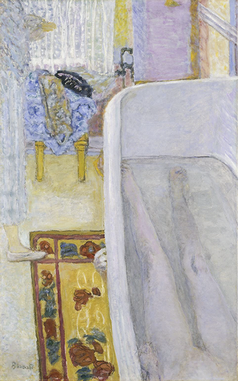
Nude in the Bath, 1925, Pierre Bonnard
© Tate, London 2019
It takes a subtle mind, comfortable with shadows, to understand hues from the purple family, the soft shades that are harbingers of nightfall. The Colour of Memory, held at the Tate Modern in spring 2019, showcased four decades of Bonnard’s unique style, up to his death in 1947. Unlike the Impressionists who painted in the moment, Les Nabis group – of which Bonnard was a founding member – painted from memory. Bonnard was unparalleled in his ability to capture fleeting memories and emotions on canvas. At once sensuous and melancholy, his paintings express moments lost in time, in particular those with his wife Marthe.
Marthe de Méligny suffered from various illnesses throughout her life and treated these with hydrotherapy. Bonnard’s paintings of her bathing, drying and dressing, are among his most iconic works. They form key markers in his development as an artist, as his partner’s withdrawal from the outside world became a shared psychological story captured in paint. Bonnard gives her a very specific atmosphere, one that is tinged with the colour mauve. We see in the shadows cast by her submerged legs, on the table cloth by the window where they ate, and in floating lozenges by the mirror in their bedroom.
In these loving, meditative images we come full circle to Monet’s raw, final painting of his beloved first wife, Camille on her Deathbed. John Berger in Selected Essays says… “A blizzard of white, grey, purplish paint… a terrible blizzard of loss which will forever efface her features. In fact, there can be very few death-bed paintings which have been so intensely felt or subjectively expressive”. Camille died in 1879 of tuberculosis, a condition for which a cure was found 70 years later in 1949 – thanks to a certain mauve aniline dye.
Picasso too found the colour deeply compelling, though used it entirely differently. “You have an interesting face,” Picasso said to the young Marie-Therese Walter standing outside a shop in 1927. “I would like to do a portrait of you. I am Picasso.” Of course she agreed, and though 27 years his junior, would become his mistress and inspire what some call his “year of wonder.” In many works – for example The Rescue, Nude, Green Leaves and Bust, and The Dream (pictured), all painted in 1932 – his lover is shaded in dreamy mauve, his colour for desire, fleshed in pigment.
And here is the eternal quandary. Much of what is extraordinary about being a human – great art, advances in medicine, the ability to travel and see the beauty in the world – are due to artificial synthesis. But much of it comes at a great price to nature, the same thing that sustains art, travel and the urge to stay in this life. The question remains, how do we get the balance right? Perhaps the answer lies simply, like Bonnard and Monet, in giving nature more time, in what psychologist Rebecca Chamberlain calls ‘slow looking’- if we spend enough time looking, nature will offer us the clues. The secret is in the colours.
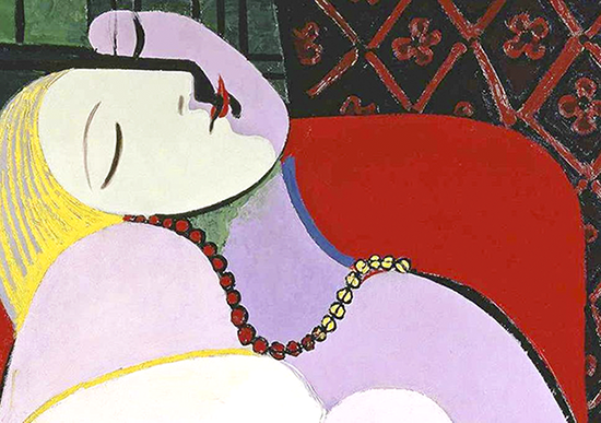
Marie-Thérèse in a detail from The Dream, 1932.
Pablo Picasso © DACS London
Source | Connections | Physis | Sense