Scarlet | Sense: How colour engages us
Source | Connections | Physis | Sense
‘It is courage, courage, courage that raises the blood of life to crimson splendour. Live bravely and present a brave front to adversity’
– Horace, 65BC-8AD
Fearlessness was something the Baroque artist Peter Paul Rubens (1577-1640) had in spades, though perhaps not modesty, once stating, “My talent is such that no undertaking, however vast in size… has ever surpassed my courage.” Urbane and charming, clever and disciplined, with his work in demand all over Europe, Rubens could claim to be the first international artist and his paintings commanded huge prices. Rubens’ expansive, cinematic work has never gone out of fashion: each generation comes to it anew. His use of colour and light is masterful, his fleshy figures reach out of the canvas and sing of blood and vitality.
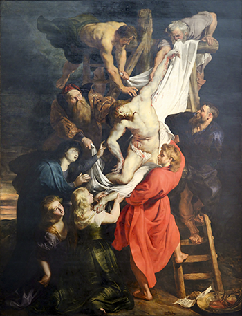
Descent from the Cross, Peter Paul Rubens, 1612-1614. Cathedral of Our Lady, Antwerp.
Rubens was a genuinely remarkable man. Described as having, “A tall stature, a stately bearing, with a regularly shaped face, rosy cheeks, chestnut brown hair, sparkling eyes but with passion restrained, a laughing air, gentle and courteous”, he was a polymath who read classical literature, saw the future of print-making (licensing his own art) and designed houses and gardens.
He was born in Siegen in 1577, not long after his father was released from jail for adultery. Jan had worked for Anna of Saxony, estranged wife of William I of Orange, and in 1571 was accused of having a passionate affair with the princess and fathering her daughter Christine, all of which he confessed to under torture. Anna herself was also locked away and died the same year Peter Paul was born. Who knows what Rubens made of this strange transgressive chapter in his parent’s life, and of his unknown royal half-sister, born six years before him? In his private life he was devoted to his mother and both his wives, and when painting female portraits used tricks of the trade to promote and elevate their status and power, placing them alongside men. In contrast, across his mythological and religious work women were fleshy, passive and sexual, their full forms giving rise to the term Rubenesque. He wrote: “I paint a woman’s big rounded buttocks so that I want to reach out and stroke the dimpled flesh.”
Rubens started his education in Antwerp, where he studied under the leading painters before spending eight years travelling around Italy and discovering the great Renaissance masters, most of all Titian, Veronese and Caravaggio. The effect on his work was marked. In 1608 he returned to Antwerp and set up his own studio. For the rest of his life he was feted, working for every royal family, becoming enobled by Philip IV of Spain and knighted by Charles I of Britain. From 1621-1630 he travelled across Europe, not only painting a staggering number of works but also carrying out complex diplomatic missions, not bad for someone whose father had been ruined by proximity to royalty.
Rubens’ great artistic power comes from his mastery of scarlet; the promise of the beating heart under the skin, or the great slashes of colour that marked his vast works. He used a dark background to contrast with the action at the foreground, using bold flashes, particularly red, to create movement. Pilkington’s Dictionary (1805) averred that, “He is by all allowed to have carried the art of colouring to its highest pitch.” In so many of his vast, energetic pieces, energy is created by this off-centre stripe of red – in Descent from the Cross, Jesus’ snowy body is balanced by the lush scarlet robe of the disciple holding him – blood and sin forgiven again. In Massacre of the Innocents (1611-1612) the shocking slaughter of the babies is kept this side of gore by the bloodlessness of their bodies, but a lurid scarlet robe reminds us that we are indeed viewing an atrocity. Rubens had seen too much death and destruction: he knew all about the power of blood. No wonder he made a great diplomat.
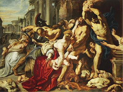
Massacre of the Innocents, Peter Paul Rubens, 1611-1612. Art Gallery of Ontario.
“I wish to approach truth as closely as possible, and therefore I abstract everything until I arrive at the fundamental quality of objects.
– Piet Mondrian, Natural Reality and Abstract Reality, 1919-1920.
If Rubens used colour to highlight movement, life and form, Piet Mondrian (1872-1944) born in the same Low Countries almost exactly 300 years later, discarded these elements and kept only structure. While Rubens stuck to primary colours to create the creaminess of flesh, Mondrian used them in order to become closer to the universe: black and white as a frame with scarlet, yellow, blue: blood, sun, sky. The fundamentals of our world and lives. Mondrian was a member of De Stijl, a post-World War I collective who embraced a utopian vision of art and its transformative potential, and whose aesthetic was as far from Rubens as you can get. The movement’s aim was to break down art, to peel away perspective and representation, stripping it down to visual geometric elements, the better to comprehend the universal. As Mondrian explained in Natural Reality and Abstract Reality, “The truly modern artist consciously perceives the abstractness of the emotion of beauty; he consciously recognises aesthetic emotion as cosmi, universal. This conscious recognition results in an abstract creation, directs him towards the purely universal”.
Mondrian’s work is instantly recognisable, yet there was no repetition: every piece was carefully and painstaking worked out for its exact geometric form. In Composition II in Red, Blue and Yellow (1930), the dominating square of brilliant scarlet is only bound by black framework on two of its sides; it appears to be escaping the very confines of the canvas, a pulsing joyous square commanding our attention.
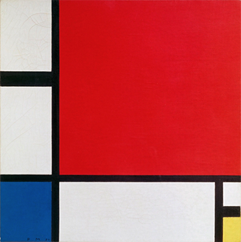
Composition II in Red, Blue and Yellow, Piet Mondrian, 1930 © National Museum, Belgrade, Serbia.
That link – of form demanding our attention – is what makes the work of Anish Kapoor (1954-) so very engaging. His large, curved, pieces speak of dualities, drawing the sky to the earth (Cloud Gate, 2004-2006) void to matter, the infinite to finite and man to woman. He works back and forth between super-reflective chrome or saturated pigments, and frequently in crimson wax, evocative of flesh, blood and transfiguration. As Stella Paul writes in Chromaphilia: The Story of Colour in Art, “Kapoor’s reds are intense… Red is the colour of the earth, it’s not a colour of deep space; it’s obviously the colour of blood and body. I have a feeling that the darkness it reveals is a much deeper and darker darkness than that of blue or black.” His reds can be explicit, like Mother Mountain, 1985, or induce perceptual disorientation like Svayambh, 2007. His latest, eponymous exhibition at the Lisson Gallery reveals paintings and sculptures based on menstruation. They are messy and graphic but also full of vitality and energy. Kapoor says, “I’ve made so-called bleeding paintings [since] the early 1980s, and I’ve gone back to it again and again. 20 years ago I made a work that was a hole in the wall with red liquid flowing out into a tank. I’ve wanted to do this forever.”
Mondrian’s angles and Kapoor’s curves are as soul-searing as Rubens’ hectic, heaving flesh: great art reveals how truly beautiful and simple colour can be, and how it can fill our hearts and emotions. There is a universality in beauty, something unifying, something humane and understood innately, whether looking for the inner meaning of life through allegory or the building blocks of form. We are, again, linked by scarlet.
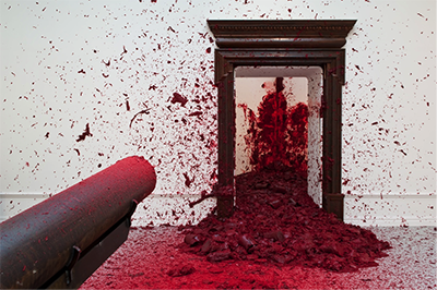
Shooting into the Corner, Anish Kapoor, 2008/2009
© Anish Kapoor. Courtesy of Lisson Gallery.
Source | Connections | Physis | Sense