Emerald Green | Connections: How colour interacts with the wider world
Source | Connections | Physis | Sense
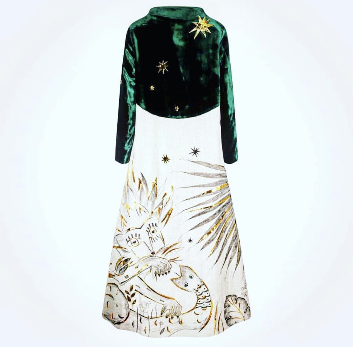
Jewel of Kings © Aigana Gali
Emeralds have been lusted after since the dawn of civilization: not just for their look but for their connotations: renewal, paradise, success. The ancients thought emeralds conferred the ability to see into the future and bring good fortune. Green was the colour of the Prophet Muhammad: Shah Jahan of India, famous for building the Taj Mahal in 1632, inscribed his collection with sacred texts and used them as talismans. In 1610 the first East India Company merchant to visit the Mughal court at Agra noted that the Emperor Jahangir’s emeralds weighed an extraordinary 412lb.
This fascination stretches into the creative world, far beyond its use as a colour. Nature and youth versus artifice, jealousy and poison: emerald is never simple but it is always compelling. The dichotomy of its meanings lends itself to creative tension – that understanding that life is both beautiful and ugly – which great art needs to come alive.
Its contrary nature fits perfectly with the language of fashion. Emerald is so perfectly harmonious in nature yet arresting and unsettling on the flesh. It taps into youth, albeit with a slightly poisonous edginess, the perfect colour for the knife-sharp Phoebe Waller Bridge who has flitted effortlessly between the multi award-winning Fleabag to the latest blockbusting Bond film. She wore an emerald-green velvet trouser suit from Victoria Beckham’s pre-spring/summer 2020 collection to her opening night at Wyndham’s Theatre this autumn. It also signals a certain classical monied elegance; less showy than red, cleverer than black: think Grace Kelly in a glorious 1950s balldress. And it is the ultimate Christmas party colour: bringing in the green with a gorgeous dress or vivid jewels, or perhaps an elegant velvet smoking jacket.
The designer Catherine Prevost, who has dressed the likes of Kate Moss, Gwyneth Paltrow and Sarah Jessica Parker, features two emerald green dresses in her Autumn/Winter collection: a winsomely pretty day dress bringing freshness to cold days, and a full-length, high necked silk creaton that non-the-less promises late evenings and sultry style. After 10 years selling privately to clients, Prevost has emerged back on the London fashion scene with a bang, selling her trademark feminine dresses with clever, elegant patterns and fabulous jewellery from her new pop-up store at 127 Sloane Street.
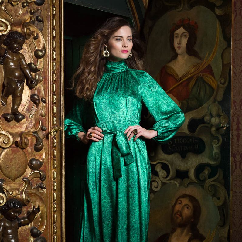
Catherine Prevost, A/W 2018
Interestingly, it is considered to be consumer suicide to put a model or star in a green dress on the cover of a magazine. Probably based on the difficulty of getting the colour right in early printing days – and risking a sickly hue – green-based magazine covers are astonishingly rare. On screen too, it is thought to render viewers uncomfortable: consider Tippi Hedren in a green suit throughout Hitchcock’s horror The Birds (1963). It is the colour of Keira Knightley’s silk and chiffon dress from the film Atonement (2007), a column of pure emerald that was voted ‘Best Costume of all Time’ by Sky Movies and readers of In Style magazine.
Adapted from Ian McEwan’s novel, when director Jo Wright asked costume designer Jacqueline Durran to create a dress for a pivotal scene, he specifically requested the colour emerald green. The unsettling vividity of the shade is used as a leitmotif throughout the film and connects us to the character Cecilia throughout – after Robbie is sent away she only wears green, and it echoes Briony’s poisonous, ruinous jealousy. The showstopper of a gown was created using a combination of Lin black, green organza and green chiffon, its tone conveying youth, freshness, temptation… and also envy and regret.
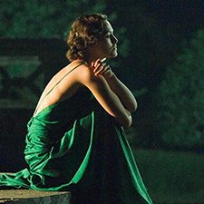
Keira Knightley in Atonement, 2007, adapted from the novel by Ian McEwan © Universal Studios
Finally, emerald green is associated with the exotic: travel to distant, verdant lands, and hot, rich jungle nights. The author L. Frank Baum used it to spectacular effect in The Wonderful Wizard of Oz (1900), in which all visitors to the Emerald City are required to wear green-tinted lenses. It’s a trick played by the Wizard, who claims that the glasses offer protection from the city’s brightness. In reality, the city isn’t green at all, but, “My people have been wearing green glasses on their eyes for so long that most of them think this really is an Emerald City.”
When Metro-Goldwyn-Mayer adapted The Wizard of Oz into a musical fantasy starring Judy Garland, the use of green glasses is cleverly marked by a switch from black and white to technicolour, and the associations with green as the colour of illusion remains. The movie speaks to our collective need to believe in the fantastic, even if we secretly know it is not real, because it nourishes our imagination and gives us hope that somewhere, over the rainbow, things can be magical.
We can feed that contrary combination – the desire to bring in nature and create a fantasy or illusion – into why this colour has become prevalent in interior design as people try to create a sanctuary within their homes. Illustrator and interior designer Vanessa Konig, who has developed two new greens for her paint range Konig Colours, Curiosity Green (Dark) and Curiosity Green (Light), says: “The lives that we lead these days are so busy, frantic and overwhelming that we need to find ways to bring green into our homes to emphasise calm and serenity.” The trend for indoor plants is bigger than ever, “especially in large woven hanging baskets” and there is a huge resurgence of botanical wallpapers with palm leaves, tropical foliage and ferns. “Different shades of green can really change your mood: darker greens create a cocooning effect, like a barrier from the outside world, bringing nature inside and rerooting ourselves. Lighter greens are energising and I see emerald green as a very pure green, one you can use in almost any room in the house, as long as it is not north facing. Sunlight is important when choosing your green. I’m always designing with an eye on the energy of a colour and how it makes us feel.”
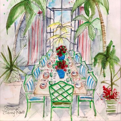
Illustration of an emerald dining room in an airy conservatory © Vanessa Konig 2019
Symbolically, emerald is used to show renewal and rejuvenation, a colour that is increasingly important in today’s complex world. Even if seeded with negativity it can bring a sense of clarity and renewal. It connects us with the material, natural world in a way very few other shades truly can.
Source | Connections | Physis | Sense