Classic Blue | Sense: How colour engages us
Source | Connections | Physis | Sense
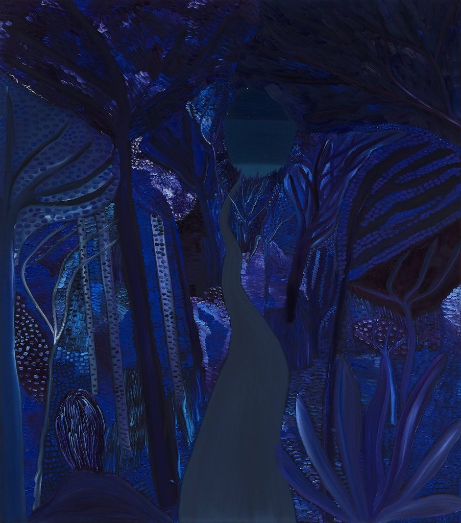
Matthew Wong, The Path, 2019 © The estate of Matthew Wong and Karma
For centuries classic blue has been used to communicate difficult-to-grasp concepts of spirituality, purity and status, becoming a ‘conduit colour’, one capable of carrying or absorbing feelings. Its associations with the watery side of emotions abounds. In a feature from The Cut, a blind person named Ashley explains how the colour blue was introduced to her: “They put my hands in their pool. They told me that that sensation I felt while swimming, that omnipresent coolness, that’s blue. Blue feels like relaxation.”
This fluidity expands to the world of the mind. Those who work with crystal therapies use the deep blue lapis lazuli as an ‘opener’, a stone to foster better communication. The renowned healer Simona xxxx of Simy Crystals, says, “It is a powerful amplifier and throat opener that promotes actives listening and speaking the truth. It boosts imagination, memory, wisdom and natural gifts. It improves relationships by expressing feelings and emotions”. As Healing Crystals explains, it is, “A Third Eye Chakra opener, connecting the physical and celestial kingdoms. Deeply peaceful, Lapis provides wisdom into mystical realms and connection with spiritual guardians, enhancing dreamwork and spiritual journeying.”
It is also shorthand for the most lachrymose of emotions. People have blue moods and get into blue funks, and as David Scott Kastan explains in his book On Color, “Blue had already come to seem so inevitable in its connection to various intensities of unhappiness that it could retire as an adjective and be reborn as a noun, no longer an attribute of feeling but the feeling itself. It became what you feel, not how.” It is the shade that allows us to share the heavy burden of sorrow or fear: classic blue reminds us that in order to appreciate the day we have to talk about the night. A whole genre of music was called forth around it – the blues – designed to allow the sons and daughters of slavery to share their burden of sadness, to lighten its heaviness by expressing the pain in their hearts. Singing the blues, as we expand in Connections [LINK], is about allowing us to join together in the commonality of loss, both large and small. Naming and expressing how we feel prevents us from being consumed by it; hence Pantone emphasises this colour can, “Open the flow of communication.”
Giving form to feelings is not always straightforward – that’s why reason music is so powerfully expressive – but for others they are best released through images: a non-verbal communication. One powerful example comes from the father of psychology, Carl Jung. During and after World War I he experienced something akin to a psychotic break. To heal his mind, to illuminate what had, “burst forth from the unconscious and flooded me like an enigmatic stream and threatened to break me,” Jung embarked on an extended self-exploration he called his ‘confrontation with the unconscious’, creating the extraordinary Liber Novus: The Red Book [link to Scarlet], a grand, illuminated work that took 16 years and developed the nucleus of his later theories. Not only does it give us direct insight into the man himself, but also shows us how he developed a positive strategy to deal with his troubles. Within the pages of this journal, Jung practiced what he was asking his patients to do: allowing the self to sink into the realm of unconscious, and then recording everything that came to light – even the dark within.
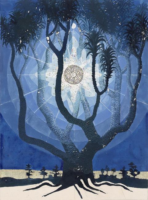
C.G. Jung, illustration from The Red Book © Foundation of the works of C.G. Jung. Reprinted with permission of the publisher, W.W. Norton & Company, 2009.
For some however the various human strategies to deal with the blues do not overcome the dark within. Matthew Wong: Blue, which showed at Karma New York until earlier in January, was a posthumous show that reveals the extraordinary talent of a painter who found solace from his dark moods through his work, but ultimately could not cope with this mortal coil. Wong took his own life aged 35, but left us with a set of extrasensory paintings which pay tribute to his living talent, exquisitely velvety night-time works with vulnerable chinks of pointillist starlight: a deeply satisfying otherworld that is dreamlike yet strangely familiar. In her article for the New York Times, critic Roberta Smith said, “Wong made some of the most irresistible paintings I’ve ever encountered… paintings extremely open and vulnerable, they leave you alone to explore the chromatic, spatial and psychological complexities.” Wong told gallerist Brendan Dugan that he wanted, “To remove myself from the work.” Alas he did.
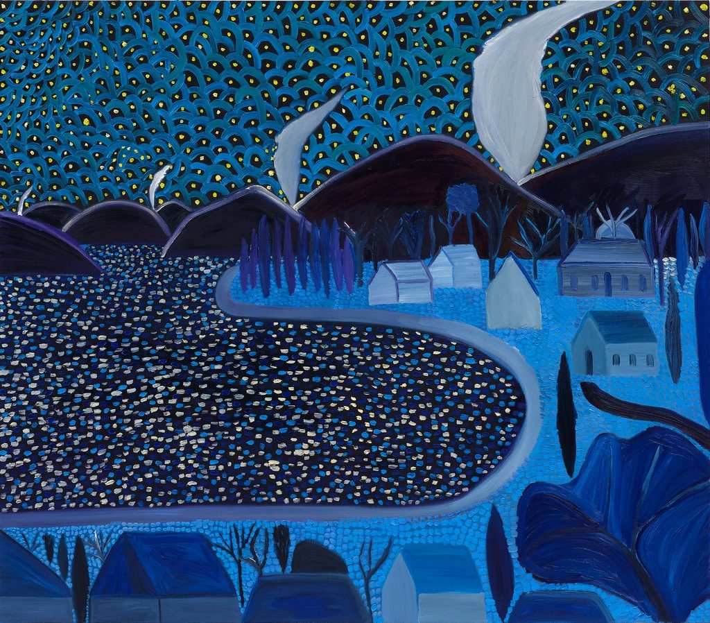
Matthew Wong, Starry Night, 2019 © The estate of Matthew Wong and Karma
This idea that one can be alone with a work of art, and find the space to work through something difficult, is central to the function of many art institutions. They are an important place for us to share feelings, many guided initially by our response to colour. These stunning works remind us that life is not just about surviving but thriving, that we need to be the catalyst, and convert all the merde that happens to us into something fertile and fabulous.
On this theme of transcendence, we turn to John Baldessari, a leading light of the art world who died on 2 January 2020 aged 88. Baldessari was someone who lived his life to the full and to its natural end: who had thrived for decades by drawing on a deep well of personal experience, self-awareness and criticism. Much loved for his audacious and wily wit, Baldessari used humour to ask probing and difficult questions about the art world and by extension the way cultural institutions function. His perspective and detachment were hard won: early on in his career he famously cremated an entire series of his own paintings, an act of self-immolation. This was his moment of transition from painter to conceptual artist, and Baldessari began to incorporate texts, found photography and appropriated images into his canvases. Somehow, by fully acknowledging his limitations in one form of expression he was liberated to create a completely new mode.
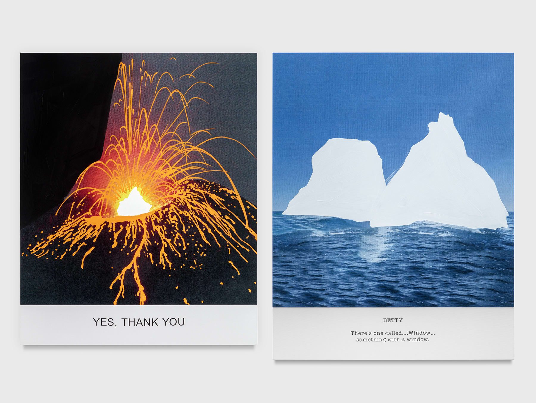
John Baldessari, 2018 © Hot & Cold Series: YES, THANK YOU/BETTY There’s one called… Window…
Of course, many artists have been through blue periods – Picasso’s mournful paintings following his friend Carlos Casagemas’ suicide, Chagall’s many watery blue ghosts of his lost wife, used to manifest his grief. These works are a reminder that after we suffer we need to find a way to flourish again. It is in doing this that we discover hope, and even making something beautiful… because the alternative is awful. If we are to survive great difficulty in this world, we should find a way to share it, so that others will find the courage to find their own particular shade of blue.
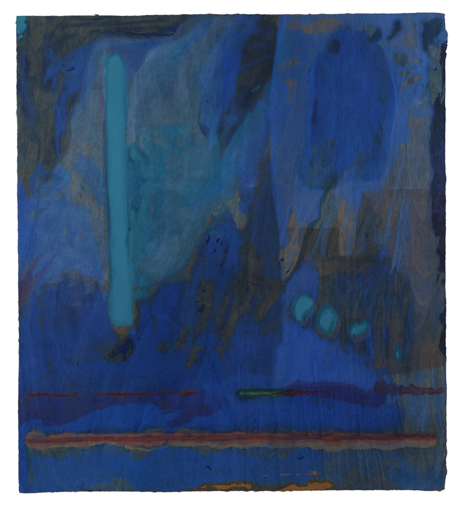
Helen Frankenthaler, Tales of Genji III, 1998 © 2019 Helen Frankenthaler Foundation, Inc./Artists Rights Society (ARS), New York/Tyler Graphics, Ltd., Mount Kisco, New York
So much of how we react to colour has to do with our past experiences. The abstract painter Helen Frankenthaler was a masterful proponent of the colour blue, having developed a painting technique called soak-stain. Instead of oils she used acrylic paints which dry fast but retain a vibrant luminosity. Her technique emulated blue’s inherent properties: she poured paint directly onto the surface of unprimed, unstretched canvas spread out on the floor. The paint soaks into the fibres and spreads across the surface of its own accord. “By pouring different pure hues directly onto her canvases, Frankenthaler could direct the flows of paint in ways that explored colour relationships in new ways,” explains Stella Paul, author of Chromaphilia: The Story of Colour in Art. Her method was often an attempt to release a memory, like a limitless sky glimpsed from a mountain top. Says Paul, “Having returned to her New York studio from an interlude in Nova Scotia, Frankenthaler later recalled that she had internalised the Canadian landscape, which had become embedded not just in her mind but also in her shoulder and her wrist. With that backdrop of mind and body, she created a lyrical, pastoral abstraction to summon a memory of a place through colour.”
As Philip Ball points out in Bright Earth: The Invention of Colour, “The use of colour in art is determined at least as much by the artist’s personal inclinations and cultural context as by the materials to hand…. In the end, each artist makes his or her own contract with the colours of the time.”
Source | Connections | Physis | Sense