Classic Blue | Source: How colour takes us on a journey
Source | Connections | Physis | Sense
“The power of profound meaning is found in blue… Blue is the typical heavenly colour. The ultimate feeling it creates is one of rest. When it sinks almost to black, it echoes a grief that is hardly human.”
– Wassily Kandinsky, Concerning the Spiritual in Art. Edition 2000
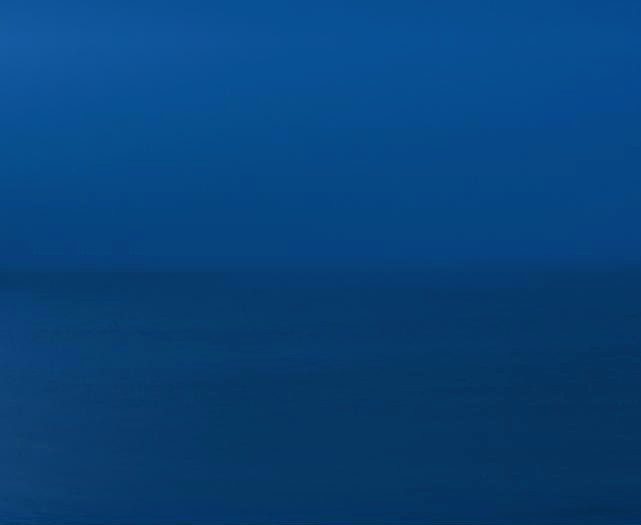
Classic blue, 2019 © Andrea Hamilton
As the sun sets, the earth’s shadow casts a band of blue on the horizon. This luxuriously deep blue, the last colour we see before everything fades to black, is the one Pantone announced as its colour for 2020, Classic Blue Pantone 19-4052. It is “a boundless blue evocative of the vast and infinite evening sky,” said Leatrice Eiseman, executive director of the Pantone Colour Institute. “Classic Blue encourages us to look beyond the obvious to expand our thinking; challenging us to think more deeply, increase our perspective and open the flow of communication.”
How could anyone have predicted that this colour would come to represent the tone of a whole world united in its fight against a virus? What was it about this particular shade that made it so relevant to the new decade? More importantly, does this colour hold the key to understanding our current universal state of mind, and by naming it can it help us through the quarantine blues?
This isn’t the bright blue of a new dawn but a reliable and reassuring shade, the rich tone that ends the day. As we come to accept a new normal, the strange new rules of social interaction and the catastrophic impact on our health and the economy, maybe this nostalgic, soothing colour can help provide a little perspective. In looking at something classic and perennial, we can begin to see how far we have come. For Pantone it: “Speaks to our feelings of anticipation… when you think about the sky at dusk, the day isn’t over. You’re thinking ‘what’s ahead of us?’ It’s reassuring and thought provoking”.
How we react to colour depends on a complex web of associations. Like scent, it is connected to our first memories, and then acquires numerous culturally and socio-politically specific associations. When you hear the words ‘classic blue’ the mind turns to ink, uniforms and tailored suits. The shade says, “Trust me, I know what I am doing”. Yet, like all the prime colours, blue is full of contradictions. It is the hue of tranquillity and peace, of a day well-lived, which is why it is also associated with maturity. It is also cold and unknowable, tinged with melancholy and sadness; a colour that signals loss. Once a royal hue, it has become the most democratic and hard working of all colours: blue blood and blue collar; NSH blue and the new blue-screen mode of working. Derek Jarman wrote in Chroma, as he was dying, “The blood of sensibility is blue/ I consecrate myself/ To find its most perfect expression”.
As fluid as water, it has an infinite capacity to reflect how we feel. William Gass named it the ‘colour of interior life’, Bob Dylan got Tangled up with Blue, and Goethe wrote in Theory of Colours, “We love to contemplate blue, not because it advances us, but because it draws us after it.” Euphoric and sad, erotic or pure, it is the vast expansive colour of both sea and sky, pregnant with possibility… a colour so conceptually variable it needs an adjective to qualify it.
This blue’s ‘classic’ status stems from its rich history, and our relationship to it is flush with our desire to reach what is difficult to grasp. Like a river running through your fingers, we are surrounded by blue but cannot easily embody it: unlike most colours a vast amount of the blue we see doesn’t come from pigment but the scattering of light: skies, pools, seas, a butterfly’s wings or the iridescent tail of a peacock. Light’s wavelengths determine different colours, and because blue light has a short wavelength between 380nm and 500nm it is easily absorbed or scattered. So the dichotomy of blue is that while it fills our horizons, it remained largely impossible for humankind to recreate until we discovered how to make it from a precious rock, lapis lazuli. Blue is the colour that most elegantly illustrates what we perceive is also what we believe; it touches the soul.
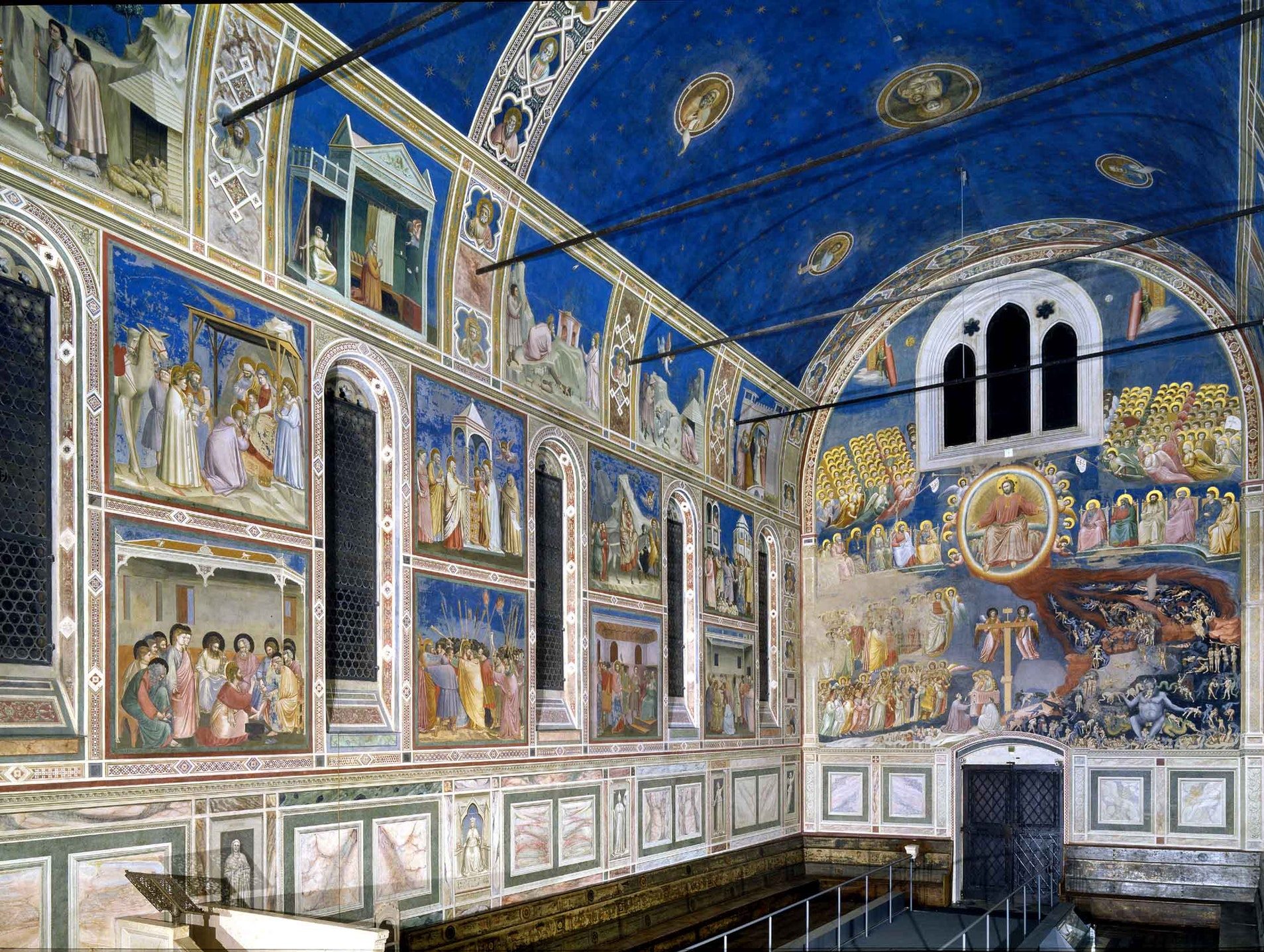
Giotto, Scrovegni Chapel, 1305
When 19th century art critic John Ruskin described blue as the colour, “Appointed by the deity to be a source of delight,” he might have been talking about Giotto. Standing beneath the ceiling fresco in the Arena Chapel, Padua (1305), punctuated by golden stars, is to behold a miracle. There is something truly infinite and expansive about the space, and has inspired generations of artists. Blue is a colour that recedes (unlike red, which flashes forwards) so artists use it to show perspective and create space in a work. Titian’s masterpiece Bacchus and Ariadne (1522), is intoxicating for the way the colour floods half the canvas, as if Ariadne’s reaching arm has created a window in the sky. The painting represents a pivotal moment in art history when blue, previously reserved solely for depicting the Virgin Mary and matters divine, was released to illustrate more profane skies and other deep human needs.
By the turn of the 20th century, it was the hue artists used more than any other to express matters of the spirit, the perfect springboard for abstraction. The great colourist Matisse used blue with exuberance, while Wassily Kandinsky believed, “Blue refers to the domain of abstraction and immateriality.” Indeed, he and Franz Marc named their Expressionist group Der Blaue Reiter (The Blue Rider). They prized blue for its ability to convey emotional and spiritual expression: “The deeper it is the more it awakens the desire for the eternal.” Sometimes it is tinged with sorrow, as in Picasso’s mournful Blue Period, but often it induces a sense of wonder. For the French monochromist Yves Klein, blue was freedom. He felt it revealed the properties of pure space and an: “Open window to freedom as the possibility of being immersed in the immeasurable existence of colour.”
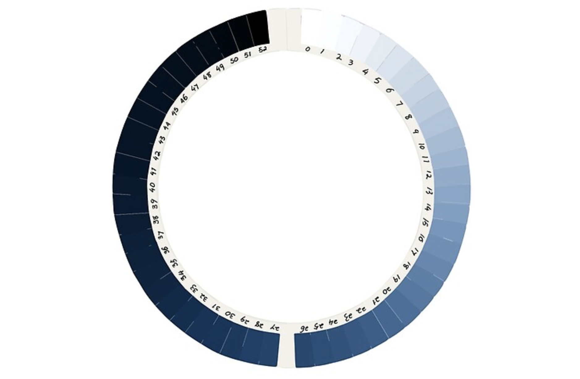
Horace-Bénédict de Saussure’s cyanometer, 1760
This idea links us to another classic chromatic moment, one where we saw the whole world was blue in William Anders’ iconic photograph Earth Rise, taken in 1968 (read more in Celestial Black). The world’s clear skies and vast expanses of ocean were heartbreakingly beautiful, a blue pearl created by the optical effect known as Rayleigh scattering. When sunlight enters the atmosphere, the wavelengths are scattered amongst spherical particles. In an unpolluted sky, these are primarily liquid water condensed onto natural atmospheric dust grains, known as a wet haze. So the best place to see true blue is from very far away – from the top of a mountain, for example. Climbers have often observed that as they climbed higher, the sky turned a deeper blue. This was of particular interest to scientists. “Ce phénomène m’avoit souvent frappé,” (“This phenomenon had often struck me”), wrote Horace-Benedict de Saussure as he prepared to summit Mont Blanc. Wanting to measure the blueness of the sky, he brought with him pieces of paper coloured different shades of blue, to match against the sky. In the next few years, Saussure refined this idea into a tool for measuring blueness, his cyanomètre, a circle of paper swatches dyed in increasingly deep blues, shading from white to black. Using this tool, which in its most advanced iteration included 52 blues, he showed how the colour of the sky changed with elevation. Still relevant today, this device encourages us to question what nature is telling us through colour. Whilst science has now answered the question ‘Why is the sky blue?’ it remains a philosophical one.
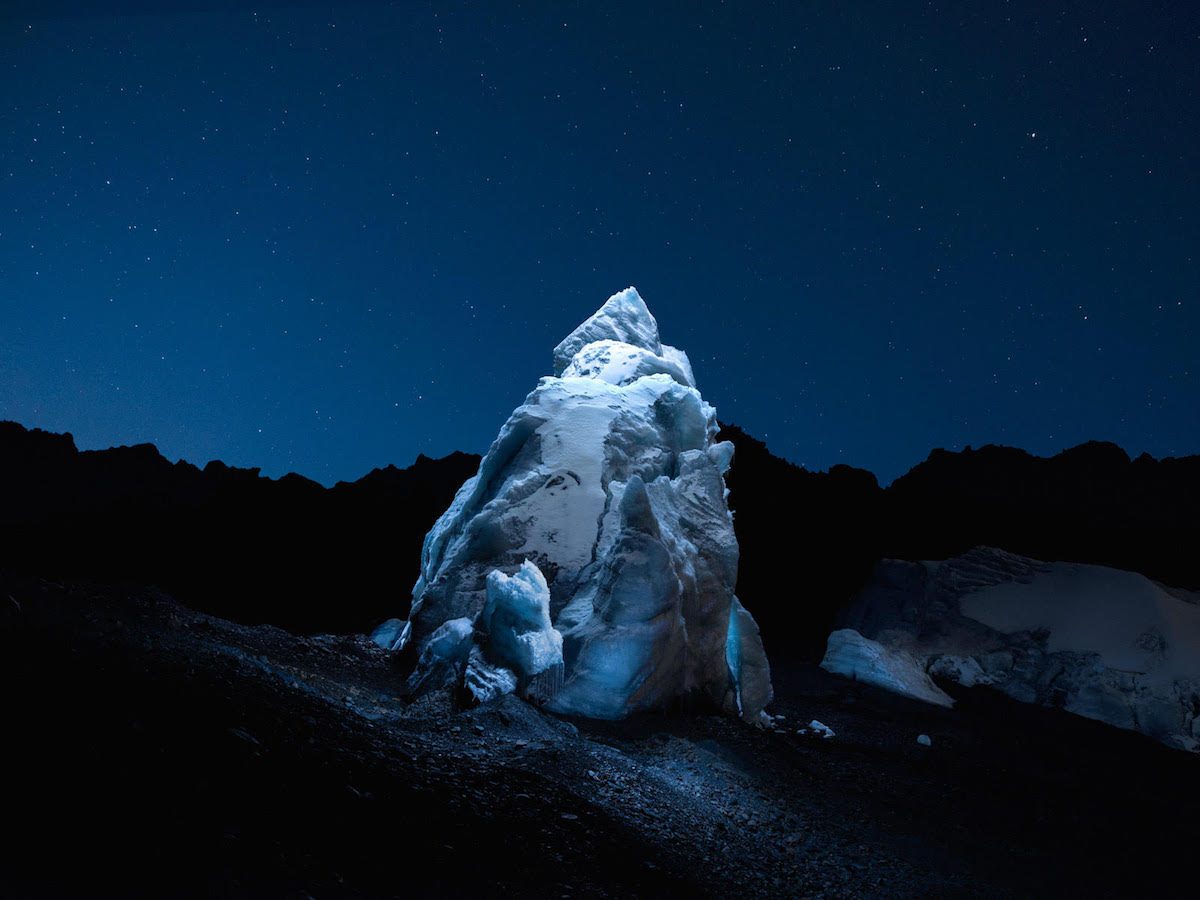
Lux Noctis, Reuben Wu © Reuben Wu 2020
It is a question of particular relevance to artists working with blue light on screens, now part of our ‘new normal’, like Reuben Wu: photographer, director, music producer and member of the electronic band Ladytron. His artistic practice is fluid: in the band he is keyboardist, songwriter and producer; his image making is also a mix of storytelling, digital, analogue and photoshop. His subject is predominantly vast empty landscapes and open skies – surreal scenes of nature in all her magnificent colours, sometimes emphasised with drone-created halos that he calls aeroglyphs. Lux Noctis is a series of photographs depicting landscapes unbound by time and space, influenced by ideas of planetary exploration, 19th century sublime romantic painting and science fiction. They are modern yet deeply nostalgic, as if documenting something lost or alien, and their tone is classic blue. “We are overwhelmed everyday by beautiful images of the familiar. I imagine these scenes transformed into undiscovered landscapes which renew our perceptions of our world,” he says.
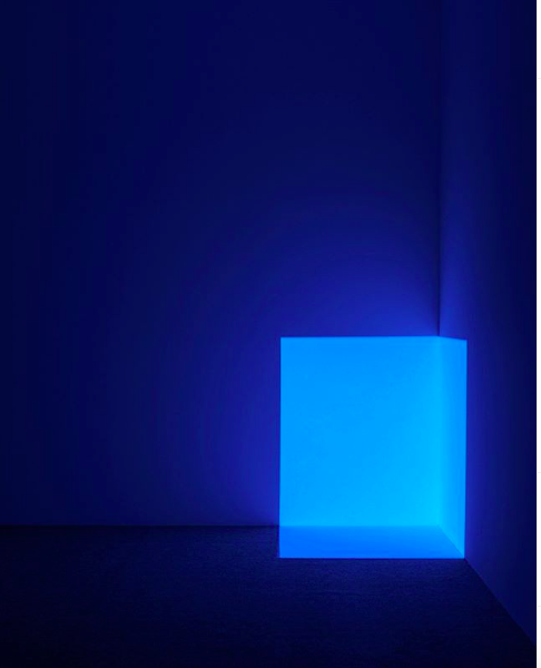
‘Squat Blue’ de la serie ‘Projection Piece’, 1968. © James Turrell. La Colección Jumex, Museo Jumex, México. Photo: Florian Holzherr
This sense of vast and absorbing landscapes and blue-tinged distance is perhaps why immersive installations were once so popular. James Turrell: Passages of Light, recently at Museo Jumex, featured light-saturated, monochrome spaces that focus our attention on time and space. Turrell talks about light being his material and perception being his medium, saying: “Rather than depicting light in some way, I want the work to ‘be light’”. To achieve this, he builds structures to conceal LED lights and disappear gallery walls, most notably in the Guggenheim’s central atrium, to create saturated fields of colour, called ‘ganza fields.’ Sculpting the light he creates ‘shallow space constructions, corner shallow spaces, wedgeworks, veils and dark spaces’. But he is equally interested in natural light, and often creates an aperture in the wall or ceiling, known as skylight series, and skyspaces, which are autonomous structures, focusing our attention on the moods of the sky. In Crystal Bridge Museum of American Art, the skyspace takes on another element: LED lights are orchestrated to change colours in sequence with the sun rise and sun set. As the walls change in colour, the sky takes on its complimentary tone. At first, the viewer becomes intensely aware of their eyes adjusting, but soon they begin to see that everything is related. He says, “My work is more about your seeing than it is about my seeing, although it is a product of my seeing.” Turrell unveils the contingent relationship between us and the world – that there is no one truth but rather what we bring to it, how we see it. Shaped like an eye, they touch on the spiritual side of perception giving a sense of our own perception and the eye of God looking down at us. His works reference his Quaker upbringing: spaces where people gather in silent prayer or meditate together until the spirit moves them to speak.
Turrell’s interest in our ancient relationship with light is supremely illustrated in his magnum opus, The Roden Crater, a project he has been working on since the late 70s when he acquired an extinct volcano in the Arizona desert. This ‘gateway to observe light, time and space’ is scheduled to open within the next five years and will feature six tunnels, 21 viewing spaces and a ‘light spa’. Turrell calls his art ‘non vicarious’, as it can only truly experienced first-hand. He explains, “People want to submit to the work, enter the realm of the work, and there is some kind of reward for that.” Indeed, many of his works begin in darkness, a feature that is central to this particular idea of blueness – the darkening sky. As artist Tacita Dean described after months of filming the horizon, “There is something about colour’s frailty at its twilight moment of oblivion that also brings out its magnificence. At colour’s juncture with night, everything is suddenly in climax…’
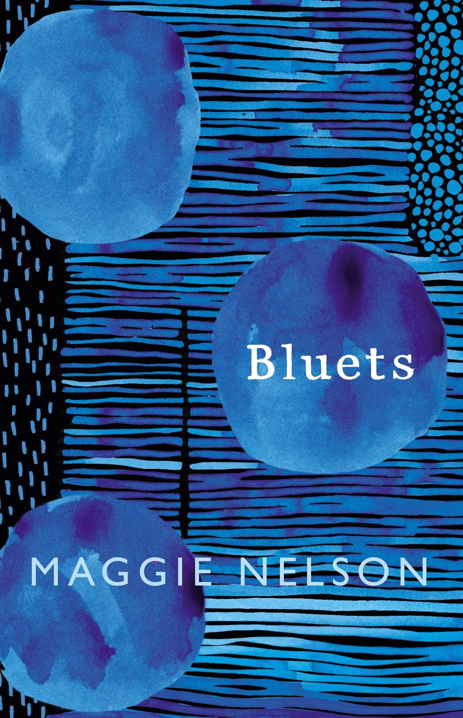
bluets © Maggie Nelson, 2009
It would be strange to talk about blue without touching on grief. When words fail us, colours remain. “Is to be in love with blue, then to be in love with disturbance? And what kind of madness is it to be in love with something constitutionally incapable of loving you back?” wrote Maggie Nelson in Bluets (2009), her intense volume of poetry. When Wittgenstein was dying, he wrote Remarks on Colour; at the end of Derek Jarman’s life, his vivid, psychedelic book Chroma helped him understand his pain. The same is true of Maggie Nelson: Bluets is dedicated to the colour blue, and to feeling blue, the title alluding to a painting by Joan Mitchell, Les Bluets (the cornflowers). Poet James Shuyler wrote about the work, “The thick blue runs and holds. All of them, broken-up pieces of sky, hard sky, soft sky. Today I’ll take Joan’s giant vision, running and holding, staring you down with beauty. Though I need reject none.” In Nelson’s opus two people preoccupy her: a friend paralysed in an accident and an ex-lover who left her heartbroken. Her fragments, 240 prose poems, follow an instinctive order and were originally written in blue ink, to follow Keats’ statement, “All words are written in water.”
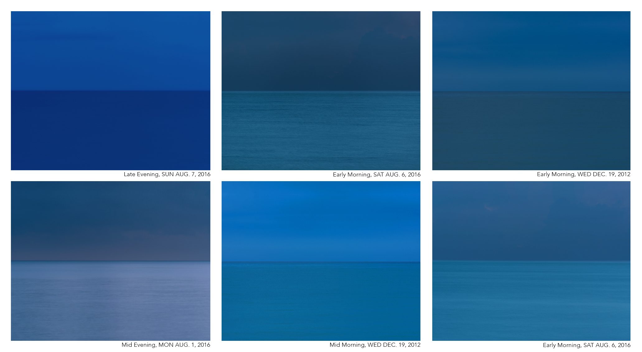
SET OF BLUE DUOCHROMES, © ANDREA HAMILTON
For the artist Fernand Leger, colour was “a means of expressing your own truth.” But which one is the classic blue, your interpretation or mine? In Andrea Hamilton’s expanding library of blues, captured on the horizon in a moment when sea mirrors sky, the answer is potentially infinite. Over time these images – 16,000 and counting – began to interact with each other, and now constitute a radiating body of work organised via colours. Drawing on abstraction and the Colour Field Painting movement, at the heart of this oeuvre is a completely new colour system: A Nomenclature of Seachroma, the first-ever library of natural sea colour, created from raw, non-Photoshopped digital files. The project, which began as a way to document time through colour, has now expanded into something interdisciplinary, one that allows the viewer to find the colours they resonate with most… and what we love is as personal and individual as a fingerprint. When her colour library opens to the public, everyone can pick their own perfect tone. Andrea says, “Creating a colour chart for someone through this library is like revealing their DNA. The colours we are drawn to are not just immediately cultural; we have an inclination towards the colours that defined our ancestor’s landscapes, and a preference for colour palettes that reflect the places we call home.”
Each image, minimal and pure in composition, asks us to look closer, not only at the universe but at ourselves, our interactions with nature, culture, philosophy, music and so much more. The Seachroma not only capture a moment in time but set up a resonance, one the 19th century mystic and writer Romain Rolland called the Oceanic Feeling: that incredible ‘sensation of eternity’ when we all feel something bigger than our selves. This is the universal truth of blue.
“When glance turns
To a sky-blue clear day,
When the purple-red sun
Sinks low at sirocco,
Here nature bestows glory,
Joy, sound to eye and heart,
And we find in color lore,
The universal truth.
― Johann Wolfgang von Goethe, Xenien
Explore Further
To 8 March, 2020: Gabriel Isak, Into the Blue, Gallerie Bernado, Stockholm, Sweden.
To 29 March, 2020: James Turrell, Passages of Light, Museo Jumex, Mexico City, Mexico.
To 25 April, 2020: Monochrome No.2, Ordovas, 25 Savile Row, London, UK.
29 March – 27 September 2020: Anish Kapoor, Sky Mirror, Houghton Hall, Norfolk, UK
Source | Connections | Physis | Sense